
In multi-level marketing (MLM), network sales, affiliate networks, or any hierarchical sales/distribution model, keeping tabs on how your downline is performing is crucial. But a simple spreadsheet or manual report can’t scale, isn’t real-time, and lacks analytics depth. That’s where custom Business Intelligence (BI) dashboards come in — enabling you to monitor downline metrics dynamically, spot trends, intervene early, and accelerate growth.
In this article, we’ll explore:
In many organizations, leaders find out about downline problems too late—only after sales drop. A custom BI dashboard flips that: it surfaces early warning signals (e.g. a drop in recruitment rates, lagging productivity) so that leadership or mentors can intervene before performance collapses.
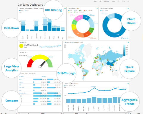
A well-designed dashboard consolidates data from multiple sources — commission systems, CRM, lead tracking tools, training modules, etc. — into one unified view. This eliminates the “spreadsheet silos” problem. BI dashboards are interactive, unlike static reports, allowing drilling into sub-levels.
With proper dashboards, you can test hypotheses (e.g. recruiting bonuses increase retention), A/B test changes in incentive structure, and link downline behavior to outcomes (sales, churn, growth). You stop guessing and start optimizing.
Rather than manually pulling and pivoting data each month, dashboards automate aggregation, filtering, alerts, and visualizations. As your network grows, the dashboard scales without linear effort.
To build an effective downline performance dashboard, you need to think about which metrics to monitor, how to structure the data, and what infrastructure supports it.
Here are essential metrics you should include, grouped by function:
| Metric Cluster | Metric Name | Why It Matters |
|---|---|---|
| Recruitment & Growth | New recruits per period (weekly, monthly) | Leading indicator of pipeline health |
| Active ratio (recruitment → activation) | Helps detect weak onboarding | |
| Dropout/churn ratio (recruited but inactive) | Signals onboarding or incentive issues | |
| Sales & Revenue | Sales volume per downline / tier | Core performance metric |
| Commission earned per downline | Shows profit contribution | |
| Sales per active agent | Productivity normalization | |
| Retention & Activity | % active downline vs total | Engagement indicator |
| Re-enrollment rate | How many renew or continue participation | |
| Training & Engagement | Training completion rate | Correlates training with performance |
| Engagement metrics (logins, session time) | Early signal metrics before sales | |
| Trend / Velocity | WoW / MoM growth trends | Momentum detection |
| Forecasted growth vs actual | Helps planning and course correction |
You’ll want these broken down by levels or tiers (e.g. 1st generation, 2nd generation), by region, product category, time period, and manager or mentor group.
To serve this dashboard reliably, consider:
Even with all the right metrics, a poor design can kill usability. Here are best practices:
Allow filtering by time period, region, product line, or mentor. This flexibility lets leaders explore “why did my downline in Region B drop?” without needing a separate static report.
Implement color coding (green, amber, red) or threshold alerts: e.g. if recruitment is < X per week OR retention < 60%, flag it visually. Some dashboards allow automated notifications (Slack, email) when metrics cross thresholds.
Include trend lines (weekly, monthly) and forecasts (e.g. via linear regression or time-series algorithms). That helps identify momentum or slumps early.
Avoid overloading the screen. Use charts that communicate efficiently: bar charts, line charts, tree maps, bullet charts. Use consistent color codes (e.g. green = good, red = warning). Avoid distractions.
Your field leaders may monitor via phones. Ensure dashboards render well on mobile or have a mobile-responsive view.
While specific public benchmarks for downline performance in MLM settings are rare (due to business confidentiality), we can draw insights from adjacent domains and BI adoption trends.
Top KPIs
Tier Breakdown
Insight: With filters, you might drill into “Region A, Tier 2” and see that recruitment is stagnating there, signaling local leadership coaching.
To keep your dashboard competitive, here are trends shaping BI dashboards and performance monitoring in 2025:
BI tools are increasingly embedding AI — not just for predictions, but for natural language querying, narrative insights (automatically generate commentary), and anomaly detection. This means a leader can type “Which downline handles dropped more recruits this month in Region B?” and get instant insight.
Academic and industry advances are making dashboard design more modular and repeatable, allowing templated dashboards that adapt to new hierarchies with minimal rework.
Instead of batch updates every day or hour, dashboards are using streaming data pipelines (Kafka, webhooks) to update leading indicators (logins, training completions) in near real time.
Non-technical leaders increasingly want to build or customize dashboards themselves. Modern BI platforms support drag-and-drop, guided templates, and low-code customizations.
To support partners or organization leaders, companies embed dashboards into partner portals or LXP (learning experience platforms) — giving controlled, role-specific views of downline performance.
With performance metrics tied to compensation, there’s more demand for transparent, auditable dashboards, including views for audit logs, version history, and traceability of metric definitions.
Here’s a roadmap to roll this out:
Monitoring downline performance via custom BI dashboards is a strategic differentiator in network-based sales and distribution models. With the right metrics, a solid data pipeline, and smart dashboard design, you can move from reactive reporting to proactive performance management. As BI tools evolve — embedding AI, supporting low-code, enabling streaming analytics — your dashboards can evolve, too.
A BI (Business Intelligence) dashboard for downline performance is a visual analytics tool that consolidates hierarchical sales or network data into real-time insights, helping organizations track productivity, retention, and revenue across multiple levels.
Custom BI dashboards enable leaders to identify underperforming tiers early, compare engagement levels, and use predictive analytics to guide coaching or incentive changes that improve overall network results.
Popular tools include Microsoft Power BI, Tableau, Looker, and Qlik Sense, which support real-time data connections, drill-down visualizations, and AI-driven insights for network analytics.
Essential KPIs include active downline members, sales per tier, churn rate, new recruits, commission trends, and training completion rates—all critical for long-term performance optimization.
Yes. Modern BI tools allow automated data pipelines (via ETL, APIs, or streaming services) to ensure your dashboard reflects the latest performance metrics without manual input.